Since 2000, the Pantone Color Institute has been anointing one lucky hue the coveted and most wildly anticipated title of “Pantone Color of the Year.” Each December, design professionals and color lovers alike anxiously await the announcement so they can begin excitedly incorporating the color into every facet of design — from graphic to interior to fashion. This year’s announcement from Pantone proclaims 2023 is the year of Viva Magenta, also known as “18-1750.” This striking red hue is brave and bold and aims to inspire those qualities in all who see it.
“Rooted in the primordial, PANTONE 18-1750 Viva Magenta reconnects us to original matter,” states Pantone Color Institute Executive Director Leatrice Eiseman. “Invoking the forces of nature, PANTONE 18-1750 Viva Magenta galvanizes our spirit, helping us to build our inner strength.”
In more recent years, other brands have joined the “color of the year” (COTY) festivities, selecting various shades to lean into in the coming calendar year. Benjamin Moore, for example, announced its color of the year as (drumroll please!): Raspberry Blush, or 2008-30. Krylon’s striking selection? The more subdued but no less exotic Spanish Moss. And let’s not overlook Glidden’s Vining Ivy, described as “bluish-greenish-something-in-betweenish,” a versatile “vibe” worthy of incorporating into your interiors—if only for a year.
Yes, from Dutch Boy’s Rustic Greige to Behr’s “Blank Canvas,” which is arguably not a color at all, any brand that dabbles in the design vertical is staking its claim in the color of the year space. With so many colors taking the title, it can be tough to choose the most tasteful way to incorporate any—or all—of these shades into your interiors.
Here are some of the most stunning spaces we’ve found on Instagram that incorporate both Pantone’s COTY and several of the others as well. Select the COTY that resonates best with your spirit, and then draw inspiration from these well-appointed spaces to bring a bit of color into your world in 2023 and beyond.
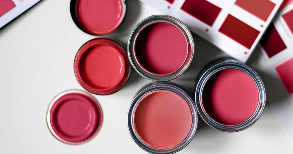
Pantone’s Viva Magenta
Here, a bold and vibrant pattern wakes up the walls. Viva Magenta brings fearless energy to this otherwise understated bedroom.
Another wallpaper option, this time from Andrea Snuggs, offers an elegant take on this outspoken color.
If you’re looking to incorporate this striking shade in a slightly less committed manner, consider adding it to your walls by way of artwork. Here, “Maps of Moments” by artist Danijela Knezevic, delivers.
Consider incorporating Viva Magenta via some richly colored and oh-so-cozy drapes. Here, they bring an added elegance that’s easy to incorporate.
Benjamin Moore’s Raspberry Blush
Incorporate this rich shade as a foundational color and balance its boldness with an array of complementary hues. Here, a children’s space exudes energy and whimsy with a touch of sophistication.
For a more outgoing use of Raspberry Blush, cover an entire wall, and offset the boldness with a more muted accent shade.
Here, two fearless shades play well together — each enjoying its own moment in the spotlight.
Behr’s Blank Canvas
For a more muted approach to your design scheme, Behr’s Blank Canvas hue allows everything else to pop. From greenery to accent pieces, it provides the perfect backdrop for creating a truly unique living space.
Blank Canvas creates an organically soothing vibe that pairs perfectly with natural fibers and warm earth tones.
Here, an entryway is quite inviting with the paneled wall in Blank Canvas as the foundation. Warm browns, yellow and green create the perfect palette to welcome anyone into the home.
Dutch Boy’s Rustic Greige
Another more muted COTY, Dutch Boy’s Rustic Greige is impactful yet understated in any setting. Use it on walls or breathe new life into an old but beloved piece of furniture. This shade is highly versatile and arguably timeless. Pair it with a stark white or a deep black — or both!
Krylon’s Spanish Moss
For Spanish Moss COTY inspiration, one need look no further than Krylon’s Instagram feed. Here, you’ll find this shade used on everything from buffets to bar carts. The versatility of this shade gives it a leg up over some of the others in that it’s a stunner both indoors and out. Pair it with gold accents for the maximum wow factor.
Glidden’s Vining Ivy
Another option in the cool color family is Glidden’s Vining Ivy. It’s blue hue separates it from Krylon’s COTY, but it’s just as impactful. We love the dramatic air it creates in this kitchen — especially when paired with bronze or gold hardware.
Here, Vining Ivy takes on a decidedly blue hue when bathed in natural light. This cool color works fabulously with rich hardwoods and natural shades of browns and yellows.
And finally, Vining Ivy can hold its own in a cacophony of colors, patterns and shapes. One might argue that, in fact, it steals the show!
We hope you’ve found some inspiration for incorporating any of these striking colors of the year into your home. Whatever color brings you joy, we say bring it on!


